software

fty

Thứ Sáu, 13 tháng 9, 2013

Windows 8.1 review: The great compromise

Microsoft is poised to release Windows 8.1, a deep and crucial revamping of the Windows 8 ideal. The code is final (though Microsoft reserves the right to tweak it further), and the time for speculation is over. Does Windows 8.1 atone for Windows 8’s sins?
Yes and no, and that answer is utterly appropriate. More than being just another update, Windows 8.1 is a lesson in true compromise—for Microsoft, and for us.

Compromises

For Microsoft, the “no compromises” mantra guided Windows 8’s development. PC or tablet, modern apps or traditional desktop software, glittering aesthetics or buckle-down productivity, Windows 8 was the operating system that was supposed to deliver it all.
But a funny thing happened on the way to ubiquity: Microsoft’s “everything and the kitchen sink” approach to its new-look operating system wound up, well, pretty darned compromised.
Rather than delivering a seamless experience, the modern UI and the desktop interface gave Windows 8 a warring, “Jekyll and Hyde” feel. To make matters worse, the operating system had a nasty habit of ripping you away from one interface and unceremoniously dumping you into the other. The modern UI—while gorgeous—felt half-baked at best, chock-full of byzantine interfaces and missing functionality. And in a bid to push everyone into the modern mobile age, Microsoft eradicated the beloved Start button and made booting directly to the desktop impossible.
More than just another update, Windows 8.1 is a lesson in true compromise—for Microsoft, and for us.
PC devotees felt jilted, and complained about their perceived second-tier status. Computer sales plummeted. Now, less than a year later, longtime Microsoft CEO Steve Ballmer hasannounced his resignation. No compromises.
My colleague Mark Hachman hit the nail on the head in his wrap-up for the Windows 8.1 Preview: “Windows users skewered Windows 8 for various sins, and Microsoft took the high road by addressing a number of the problems in 8.1.”
The new shutdown options in the power menu.
That effort to meet in the middle is embodied by Windows 8.1’s new boot-to-desktop option. Although the feature is as simple as simple could be, and buried deep in an obscure submenu, its existence is a boon to desktop diehards who resorted to arcane workarounds to avoid Windows 8’s mandatory Start screen. The boot-to-desktop option makes using Windows 8 on nontouch devices far less frustrating; ditto for the new shutdown options found in the ‘Power User’ menu, which you can open by pressing Windows-X or by right-clicking the lower-left corner of the desktop.
Ironically, while the tweaks stray from Windows 8’s modern-first focus, they help Windows 8.1 inch closer to the “no compromise” ethos by letting a PC be a PC.
Not all of Windows 8.1’s desktop tweaks are quite as welcome. For one thing, the File Explorer doesn’t show libraries by default anymore (though you can easily restore them by selecting View > Navigation Pane > Show Libraries). More contentious is the much-ballyhooed return of the Start button—but not the Start menu and its list of programs and shortcuts.
Clicking the Start button deposits you among the live tiles of the modern Start screen. The jump is confusing at first, but it makes sense if you think of the Start screen as a modern Start menu. What’s more, Windows 8.1 allows you to tweak the Start button to open the Start screen’s All Apps list instead, which delivers a much more Start menu-esque experience while still enveloping you in the modern UI. The new approach is a reasonable compromise, but it also demands compromise from you.

Flattening the learning curve

The new Help + Tips app ensures that assistance for novices is just a click away.
The Start button’s new functionality isn’t there just to irritate you, though: It provides a visual clue as to how to exit the desktop, and it reinforces the notion that the Start screen replaces the old Start menu. “Aha!” you’ll say when you click it and open the Start screen the first time. “Now I get it!”
The hints don’t stop there. While Windows 8 was lambasted for its hands-off, sink-or-swim approach to guiding users through the revamped UI—it was so bad that many manufacturers preinstalled their own tutorial apps on their PCs—Windows 8.1 is packed with helpful usability clues and improvements.
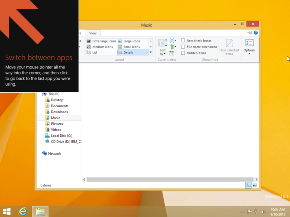
Whereas Windows 8 cast new users into the mix with nary a peep, Windows 8.1 veritably beats newcomers over the head with helpful tips such as the one shown here.
Big, bold boxes pop up after installation, clearly identifying the various hot corners and explaining how to use them. A new, baked-in Help + Tips app provides straightforward tutorials on all aspects of controlling your machine, with lush visuals and short animations. A downward-pointing arrow appears when you move your mouse on the Start screen, marking the way toward the All Apps screen. Even the Windows Store received an overhaul for easier browsing.
It’s wonderful. Windows 8.1 will still be a shock to new users, but it promises a far easier learning curve than Windows 8 required.

Usability calibrations
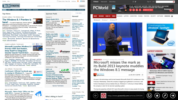
Two Internet Explorer windows, each snapped to fill half the screen.
Once you’ve dispensed with the basics, Windows 8.1’s ability to have three or more apps “snapped” open at once, complete with the option to adjust the size of each app dynamically, amps up the usability of the modern UI. (Windows 8 proper allows only two apps on screen at once, in a 75/25 split.) Also new, some apps—such as Internet Explorer 11—can open in multiple windows. The feature is no competition for the variability of traditional desktop windows, but hey: compromise.
The free update also beefs up the modern-style PC Settings menu, adding numerous options that previously required a jaunt into the desktop Control Panel. Likewise, the SkyDrive app now lets you browse through your local files, serving as a modern-style pseudo-File Explorer. Again, they’re small tweaks, but the fixes make it easier to stay in your interface of choice.
Some of the new options available in PC Settings.
If you do decide to break down the interface walls, Microsoft made the transition easier with some UI-spanning additions that really help Windows 8.1 feel like a cohesive whole. The new and superb Bing Smart Search—one of the top five reasons to upgrade to Windows 8.1—pulls in information from modern apps, desktop files, and the Web alike, creating a comprehensive list of results. (Too bad about the ads, though.)
Meanwhile, another new option lets you share your desktop wallpaper with the modern Start screen, imbuing the entire OS with a unified feel. Rough patches remain, but switching from the modern UI to the desktop is mostly less jarring and more voluntary than before.
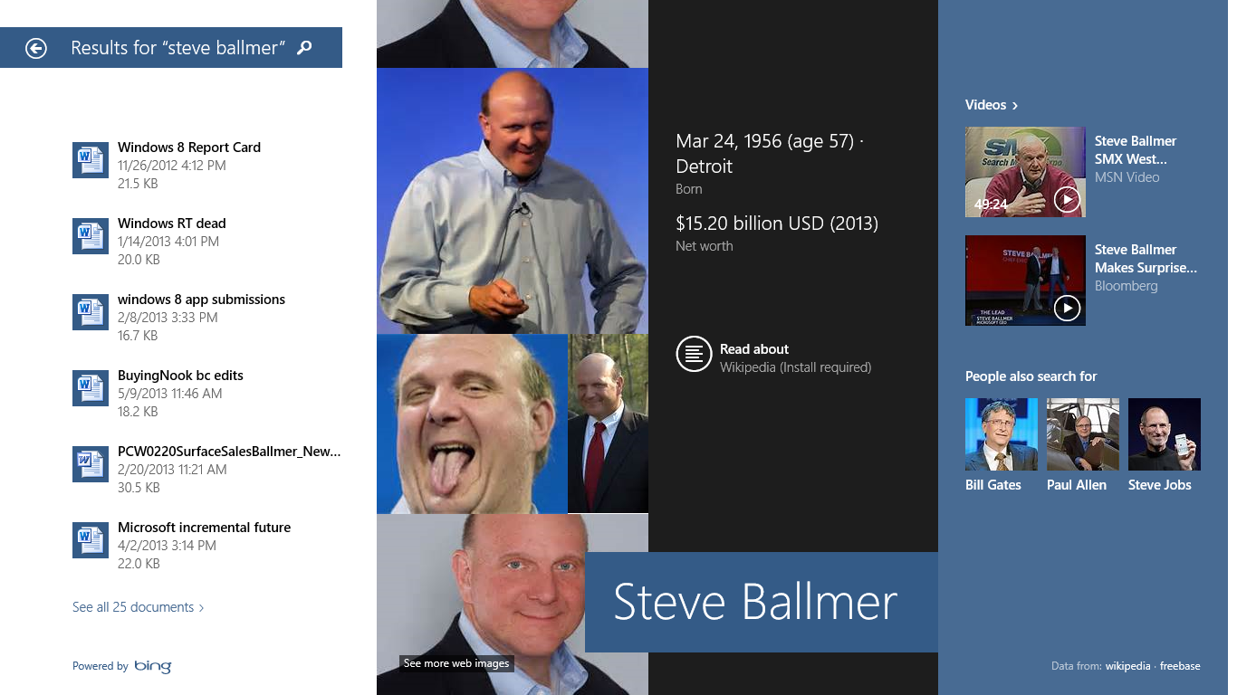
Bing Smart Search pulls in results from every corner of your PC, your apps, and the Net.
Microsoft has even enhanced the lock screen so that you can answer Skype calls and snap camera shots without unlocking your device.
That isn’t to say Windows 8.1 fixes every flaw, though. I’d still like to see some sort of visual indicator for the hidden charm bar, and a more obvious way to shut down or restart the machine. Many options remain buried beneath superfluous clicks and menus, as well.

Iterating into the future

The new Bing Health & Fitness app in Windows 8.
By and large, the Windows 8.1 RTM version (that is, the version shared with manufacturers) largely mirrors the Windows 8.1 Preview—it’s packed with an abundance of new features, new hidden secrets, and even a plethora of new apps. Since our previous articles talked about the majority of the fresh features in far greater depth than I could here, I’ll just mention that a slightly tweaked version of the Skype app comes baked in to Windows 8.1, replacing Windows 8’s Messaging app.
Virtually all of Windows 8.1’s baked-in modern apps have seen an overhaul of some sort; the retooled Mail app shines especially brightly. (Yay for opening mail in a new window!) Rather than diving into the minutiae, let’s take a minute to talk about what these changes mean for Windows.
Người đăng: Unknown vào lúc 22:11 Không có nhận xét nào:
Gửi email bài đăng nàyBlogThis!Chia sẻ lên XChia sẻ lên FacebookChia sẻ lên Pinterest

Covers the basics, but video quality is lacking

The good: Skype for Windows Phone's simple interface lets you call, video chat, and instant message your friends without any hassle.
The bad: Video quality isn't great even over a fast Wi-Fi connection, and you can't create or manage your Skype account from the app.
The bottom line: Skype for Windows Phone is a simple and stable app for free video calls and messaging, but poor video quality will disappoint power users.
Looks-wise, Skype for Windows Phone is almost identical to the Android and iOS Skype apps. Unfortunately, the video quality isn't as impressive as it is on other platforms, and the app is missing a few features.
Skype is a service that lets you send instant messages and place video and voice calls over the Internet. What started as a desktop app eventually moved to mobile, with Windows Phone getting the app last, in February 2012, just four months after Microsoft's acquisition of Skypefor $8.5 billion was finalized in October 2011.

Skype for Windows Phone sends your messages with video (pictures)

1-2 of 5
Scroll LeftScroll Right
Getting started
You'll need to sign in to a Skype account to use the app. If you don't already have one, you can sign up from the app, but I don't recommend it, as once you tap "create a Skype account," the full-size sign-up page launches in Internet Explorer, which is a pain to fill out on a smartphone-size screen. This is not the case with the other mobile Skype apps.
If your Skype account is already linked to your Microsoft account, you can sign in with those credentials. However, if you haven't already linked your Skype and Microsoft accounts, you can't do it from the app -- you'll need to download a desktop version of Skype to accomplish that.
It's disappointing that there's no way to sign in with the Microsoft account that you must have set up on your phone in order to have downloaded the app in the first place. It's worth noting you can't link your Skype and Microsoft accounts on any of the mobile apps, either, but I was hoping Microsoft would put a little more thought into the app it built for its own mobile platform.
Instant message, voice calls, and video chat
After you sign in, you see your most recent Skype activity first, including phone calls and chats. On that main screen, you can quickly make a voice call or start a new chat. Unfortunately, you can't easily initiate the most-used feature of Skype: video calling.
Starting a video call is a tedious process that involves swiping over to your contact list, shown in the app as "People," tapping on a person's name, then tapping the video camera button that appears. The app then launches your front-facing camera and shows the other person's video feed full-screen, with your video feed in a smaller window on the right. You can switch the camera or turn off the video altogether, plus you can mute your microphone.
In order to test the video call quality, I used two Windows phones (a Nokia Lumia 925 and HTC 8X) and two Android handsets (Samsung Galaxy Note 2 and Galaxy S4) on the same Wi-Fi network standing in the same location. Video calls between the two Windows phones looked unimpressive and overall fuzzy. Calling from Windows phone to an Android phone gave me slightly sharper video quality, but nowhere near as clear as Skype on Android.
Voice calls performed better, with no significant audio issues, though both video and voice call quality depends on your data or Wi-Fi connection, so your experience may be different.
Skype for Windows Phone
You can clearly see the difference in video quality on Skype for Android (left) and Windows Phone.
Người đăng: Unknown vào lúc 22:10 Không có nhận xét nào:
Gửi email bài đăng nàyBlogThis!Chia sẻ lên XChia sẻ lên FacebookChia sẻ lên Pinterest

Seeing double

he Motorola Droid Maxx is an Android phone with an impressive battery life, a 5-inch screen, a dual-core processor, and a number of convenient features. You can twist the phone to quickly launch the camera, the display pulsates to let you know when you have a new notification, and you can command the phone from across the room by saying the magic words, "Ok Google Now".

Seeing double

MICHAEL HOMNICK
The Droid Maxx (left) and the Droid Ultra (right).
If you're getting deja vu, it's because these are all features we've already seen on both the Droid Ultra (and to some extent, the Moto X). There's not much to say about the Droid Maxx that hasn't already been said about the Droid Ultra: They share the same processor, screen size, and camera, making them hard to tell apart at first glance. The two phones are so similar that I'm going to focus this review on the few differences between the two handsets and point you to my review of the Droid Ultra if you want know how well all the other aspects perform.
The Droid Maxx looks nearly identical to the Droid Ultra, but it's a bit thicker and features a nice-feeling kevlar back. The kevlar helps make the Droid Maxx appear more rugged, and it feels a bit better in the hand than the Droid Ultra. The Maxx lacks the visual flair of other high-end phones like the HTC One or iPhone 5s, but its overall build quality is a step up from last year's boxy Droid Razr Maxx HD. It's unassuming and uninspired, but at least you won't have to worry about the phone falling apart in your pocket or shattering into smithereens the first time you drop it.
MICHAEL HOMNICK
The kevlar back on the Droid Maxx feels good.
While it's not the most aesthetically impressive phone out there, the Droid Maxx is worth considering for its battery life alone. The 3500mAh battery and can go several days on a single charge. In our lab tests we scored the Droid Maxx at 13 hours and 28 minutes of continuous HD video playback, beating out both the iPhone 5 andGalaxy S4 by a solid 5 hours. It's currently the longest-lasting smartphone we've ever reviewed and hopefully other phone makers sit up and pay attention—all your fancy phone features don't mean much if your phone dies after just a few short hours of use.

Bottom line

Aside from its exceptional battery life, the Droid Maxx is about as average as you can get for an Android phone. It looks similar to the Droid Ultra and most of its marquee software features are available on other Motorola devices like the Moto X. At $300 with a new 2-year contract on Verizon, the phone is the most expensive of the Droid line and hard to recommend to anyone but the most battery hungry consumers. If you hate that you can't go more than a day without charging your phone then the Droid Maxx should suit your needs just fine. For everyone else, the Moto X also offers impressive battery life in a form-factor that's much more aesthetically pleasing for significantly less money.

Motorola Droid Maxx

At a Glance

The Motorola Droid Maxx has superb battery life but doesn't do much else to differentiate itself from its siblings or the rest of the Android masses.
View full product specs »
Price when rated:$300

Pros

  • Excellent battery life
  • Solid build quality

Cons

  • Visually unappealing
  • Weak camera
 CO
Người đăng: Unknown vào lúc 22:09 Không có nhận xét nào:
Gửi email bài đăng nàyBlogThis!Chia sẻ lên XChia sẻ lên FacebookChia sẻ lên Pinterest

Populating your feed

The best thing about Material is its dead-simple setup process. Right when you download the app, all you have to do is log in with either your Twitter or Facebook account, and wait as Material analyzes your data. Of course, if you log in with both of your social accounts, then the app will have more to analyze and thus a better opportunity to home in on your interests. But I signed in with only my Twitter account and still, it appeared to do just fine. The caveat here is that you must actually use the social account that you link, otherwise Material won't have much to work with.
Now, here's what makes Material unique. Once the app finishes analyzing your social data, its algorithm creates a sort of digest filled with stories relevant to your interests. The app feeds you a different digest twice a day (Morning Edition and Afternoon Edition), and each is tailored to your ongoing social graph, almost like a personalized magazine. Stories are divided into categories like Computing, Film, Design, and Basketball. And if the algorithm didn't get all of your interests right, you can manually delete or add categories as needed.
To get set up, just sign in to your Twitter or Facebook account, and wait while Material puts together your digest.
(Credit: Screenshot by Jaymar Cabebe/CNET)
While other apps, like Flipboard and Feedly, mostly rely on you adding specific news sources to your feed, Material does all the work for you. Based on your interests, it fills your digest with stories from sites ranging from large-scale news outlets to smaller independent blogs. With this system, you don't get to carefully curate your feed, but you do get to see stories from sites you otherwise might not have known about. And that element of discovery is valuable.
Consuming content
Overall, Material's interface is well designed, with lateral and vertical swipe gestures to go between stories and categories. The category screens are nice, with full-width images and bright colors. And the popped-out story pages give you a no-frills view of stories, similar to what you would see in an RSS reader app like Feedly. You can even jump to a full Web view of a story by hitting the double-arrow button up top, and you can share a story via Android's Share protocol.
Người đăng: Unknown vào lúc 22:08 Không có nhận xét nào:
Gửi email bài đăng nàyBlogThis!Chia sẻ lên XChia sẻ lên FacebookChia sẻ lên Pinterest

Value of reviews

The most obvious value of software reviews (especially formal reviews) is that they can identify issues earlier and more cheaply than they would be identified by testing or by field use (the defect detection process). The cost to find and fix a defect by a well-conducted review may be one or two orders of magnitude less than when the same defect is found by test execution or in the field.
A second, but ultimately more important, value of software reviews is that they can be used to train technical authors in the development of extremely low-defect documents, and also to identify and remove process inadequacies that encourage defects (the defect prevention process).
   
This is particularly the case for peer reviews if they are conducted early and often, on samples of work, rather than waiting until the work has been completed. Early and frequent reviews of small work samples can identify systematic errors in the Author's work processes, which can be corrected before further faulty work is done. This improvement in Author skills can dramatically reduce the time it takes to develop a high-quality technical document, and dramatically decrease the error-rate in using the document in downstream processes.
As a general principle, the earlier a technical document is produced, the greater will be the impact of its defects on any downstream activities and their work products. Accordingly, greatest value will accrue from early reviews of documents such as marketing plans, contracts, project plans and schedules, and requirements specifications. Researchers and practitioners have shown the effectiveness of reviewing process in finding bugs and security issues,.[4]
Người đăng: Unknown vào lúc 22:04 Không có nhận xét nào:
Gửi email bài đăng nàyBlogThis!Chia sẻ lên XChia sẻ lên FacebookChia sẻ lên Pinterest

IEEE 1028 generic process for formal reviews

IEEE Std 1028 defines a common set of activities for "formal" reviews (with some variations, especially for software audit). The sequence of activities is largely based on the software inspectionprocess originally developed at IBM by Michael Fagan.[3] Differing types of review may apply this structure with varying degrees of rigour, but all activities are mandatory for inspection:
  • 0. [Entry evaluation]: The Review Leader uses a standard checklist of entry criteria to ensure that optimum conditions exist for a successful review.
  • 1. Management preparation: Responsible management ensure that the review will be appropriately resourced with staff, time, materials, and tools, and will be conducted according to policies, standards, or other relevant criteria.
  • 2. Planning the review: The Review Leader identifies or confirms the objectives of the review, organises a team of Reviewers, and ensures that the team is equipped with all necessary resources for conducting the review.
  • 3. Overview of review procedures: The Review Leader, or some other qualified person, ensures (at a meeting if necessary) that all Reviewers understand the review goals, the review procedures, the materials available to them, and the procedures for conducting the review.
  • 4. [Individual] Preparation: The Reviewers individually prepare for group examination of the work under review, by examining it carefully for anomalies (potential defects), the nature of which will vary with the type of review and its goals.
  • 5. [Group] Examination: The Reviewers meet at a planned time to pool the results of their preparation activity and arrive at a consensus regarding the status of the document (or activity) being reviewed.
  • 6. Rework/follow-up: The Author of the work product (or other assigned person) undertakes whatever actions are necessary to repair defects or otherwise satisfy the requirements agreed to at the Examination meeting. The Review Leader verifies that all action items are closed.
  • 7. [Exit evaluation]: The Review Leader verifies that all activities necessary for successful review have been accomplished, and that all outputs appropriate to the type of review have been finalised. 

Người đăng: Unknown vào lúc 22:03 Không có nhận xét nào:
Gửi email bài đăng nàyBlogThis!Chia sẻ lên XChia sẻ lên FacebookChia sẻ lên Pinterest

The process

The inspection process was developed by Michael Fagan[1] in the mid-1970s and it has later been extended and modified.
The process should have entry criteria that determine if the inspection process is ready to begin. This prevents unfinished work products from entering the inspection process. The entry criteria might be a checklist including items such as "The document has been spell-checked".
The stages in the inspections process are: Planning, Overview meeting, Preparation, Inspection meeting, Rework and Follow-up. The Preparation, Inspection meeting and Rework stages might be iterated.
 
  • Planning: The inspection is planned by the moderator.
  • Overview meeting: The author describes the background of the work product.
  • Preparation: Each inspector examines the work product to identify possible defects.
  • Inspection meeting: During this meeting the reader reads through the work product, part by part and the inspectors point out the defects for every part.
  • Rework: The author makes changes to the work product according to the action plans from the inspection meeting.
  • Follow-up: The changes by the author are checked to make sure everything is correct.
The process is ended by the moderator when it satisfies some predefined exit criteria. The term inspection refers to one of the most important elements of the entire process that surrounds the execution and successful completion of a software engineering project.
Người đăng: Unknown vào lúc 22:02 Không có nhận xét nào:
Gửi email bài đăng nàyBlogThis!Chia sẻ lên XChia sẻ lên FacebookChia sẻ lên Pinterest

An Analytical Review of Process-Centered Software Engineering Environments

Process-centered Software Engineering Environments, or PSEEs, are intended for the definition, modification, and enactment of software process models, they thus bring software development processes into effect. Even though research efforts in process-centered software engineering abound, PSEE technology has not received the attention that it deserves. In order to create a concise but effective and practically applicable evaluation framework for PSEEs, this paper first presents a survey of PSEEs and highlights the current state of the art of the technology. The PSEEs which have been reviewed herein have been regarded as software systems, and as such, have been characterized in terms of their requirements. After providing a conceptual critique of the scope and nature of conventional PSEEs, a detailed criteria-based evaluation of a select set of several recent PSEEs has been conducted. The evaluation criteria have been derived from PSEE requirements and the results of the critique, and have then been refined and evolved into the final criterion set.


Người đăng: Unknown vào lúc 22:01 Không có nhận xét nào:
Gửi email bài đăng nàyBlogThis!Chia sẻ lên XChia sẻ lên FacebookChia sẻ lên Pinterest
Bài đăng mới hơn Trang chủ
Đăng ký: Bài đăng (Atom)

Lưu trữ Blog

  • ▼  2013 (8)
    • ▼  tháng 9 (8)
      • Windows 8.1 review: The great compromise
      • Covers the basics, but video quality is lacking
      • Seeing double
      • Populating your feed
      • Value of reviews
      • IEEE 1028 generic process for formal reviews
      • The process
      • An Analytical Review of Process-Centered Software ...

Giới thiệu về tôi

Unknown
Xem hồ sơ hoàn chỉnh của tôi
Chủ đề Đơn giản. Được tạo bởi Blogger.